
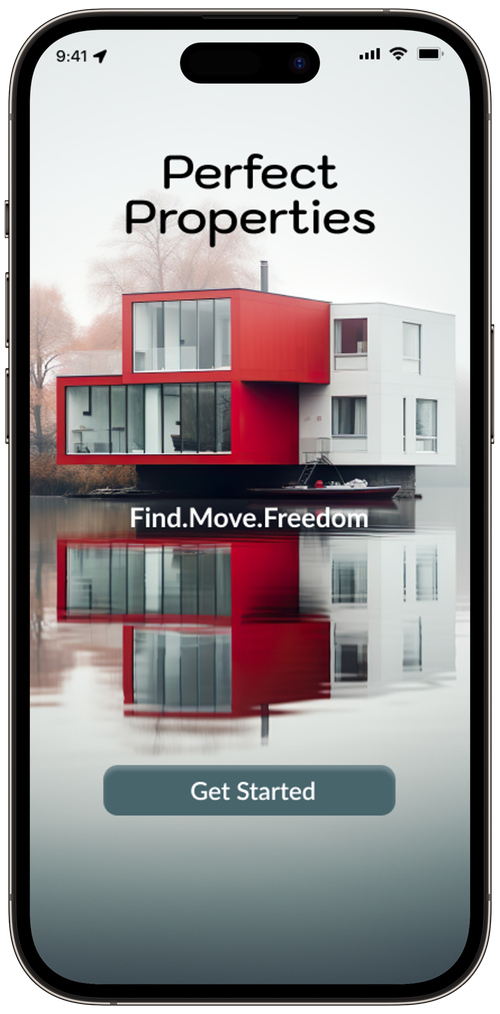
Perfect Properties
Overview
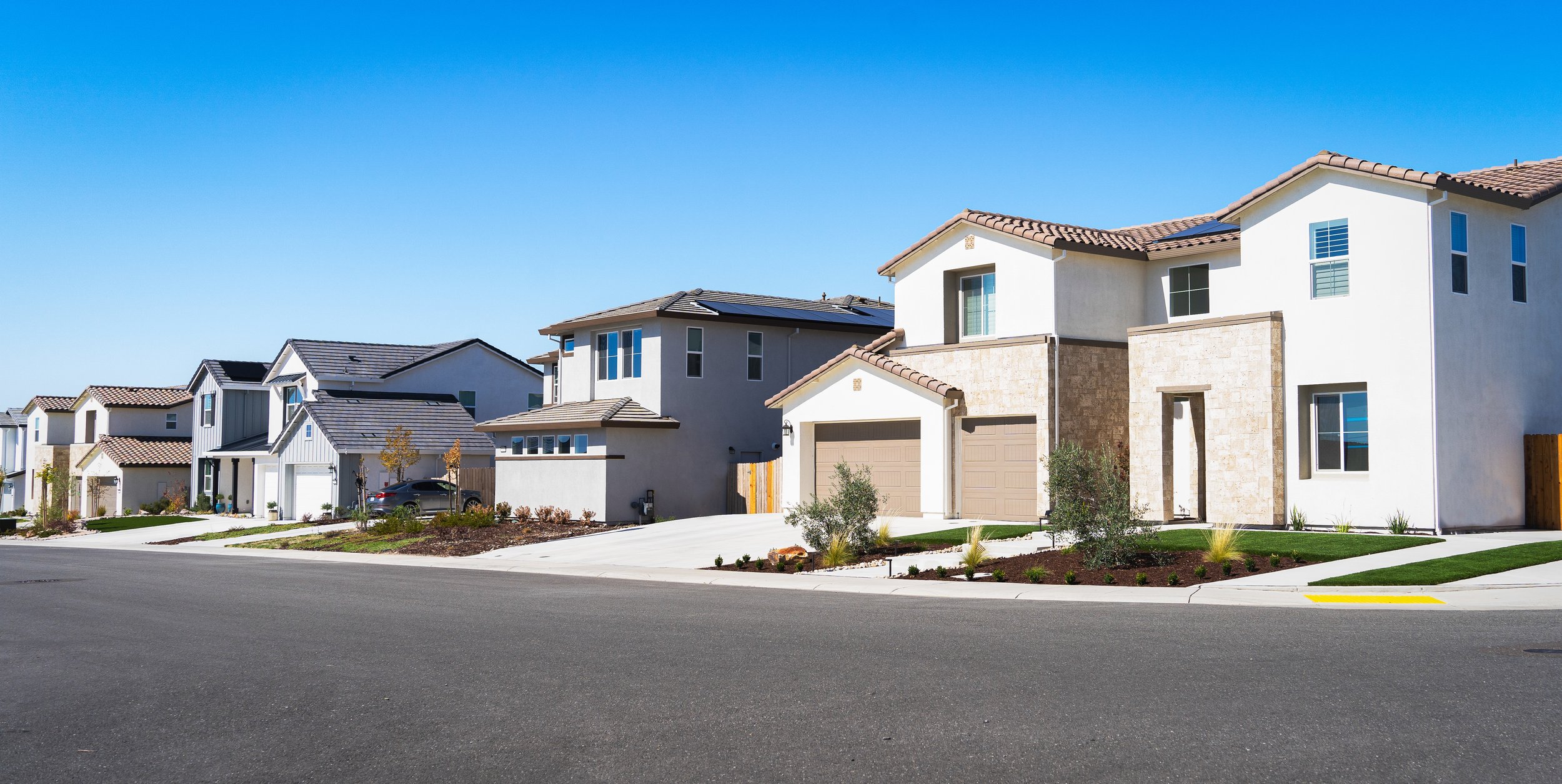
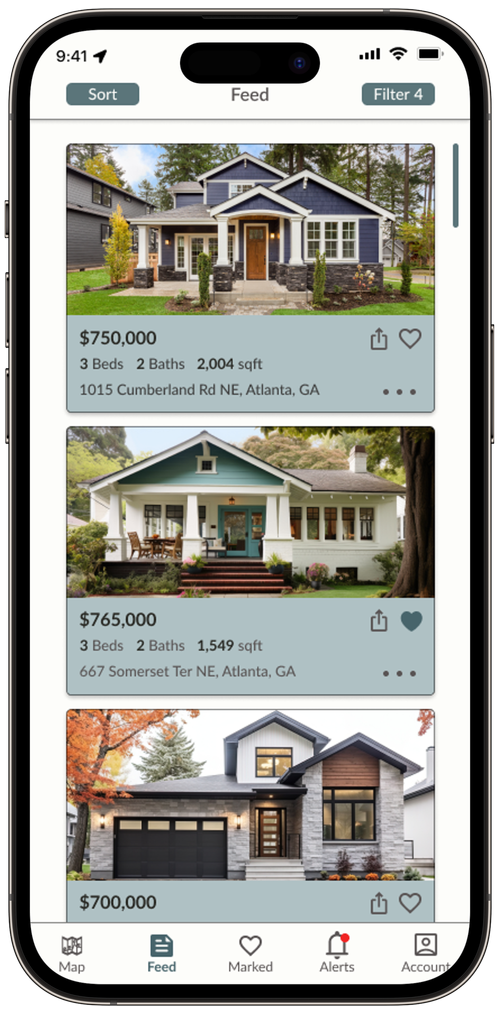
Real Estate has become an integral part of the rising economy in the world today and financial security for years. Tho, there are many sites offered to users, there is a main issue for new buyers that they get confused or flustered when looking for homes via a mobile or web app. This where the Perfect Properties app steps in.

“We want the user to be able to search and filter thru properties, so they can find good matches based on their needs.”

Challenge
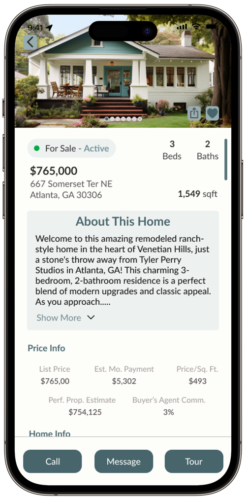
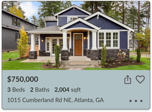
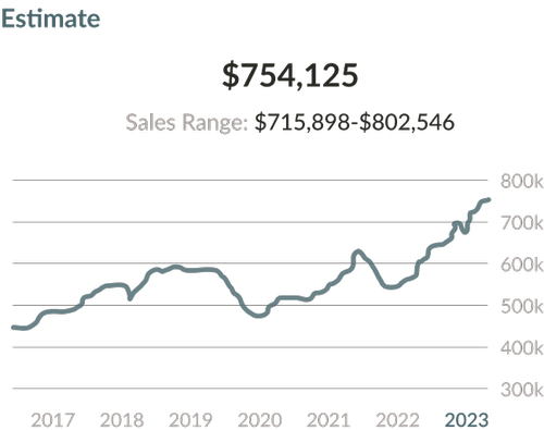
Perfect Properties needs to give new buyers an opportunity to find homes quickly and efficiently. It needs to offer them a selection of homes that are near their options. Lastly, there has to be an easier way to contact the agent towards said home.
Business Goals
“Have the user save time in reading and not be dumped with unorganized info that is on other competitors.”


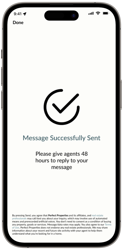
“The user should be able reach out to the right people towards the house they are interested in, to view it.”
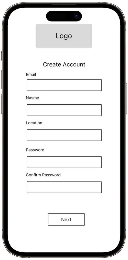
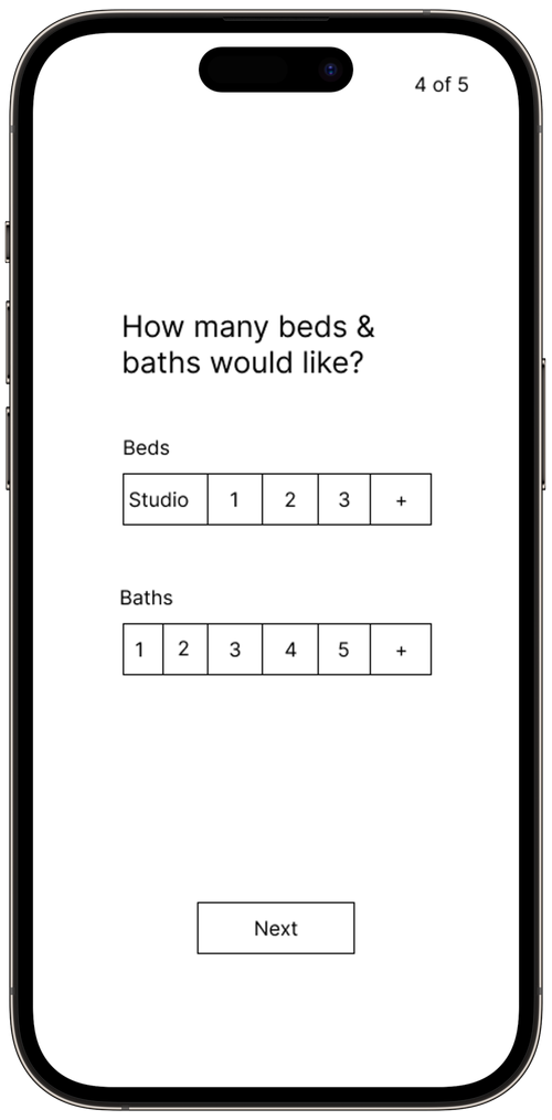
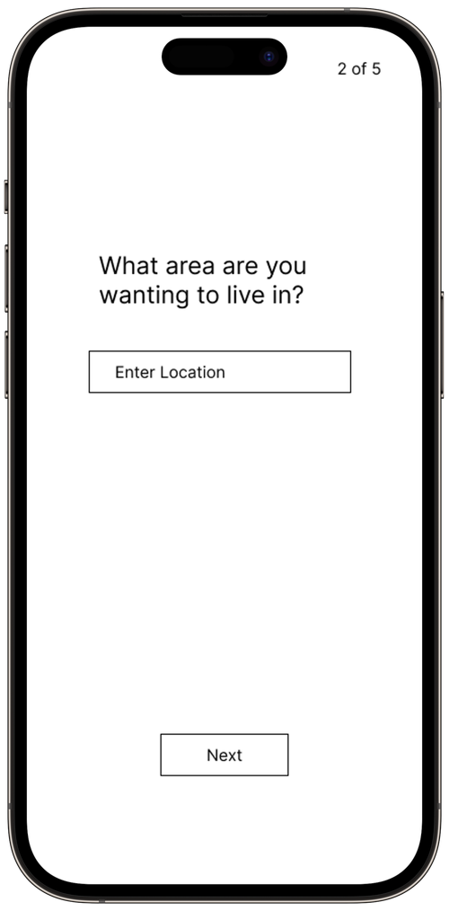
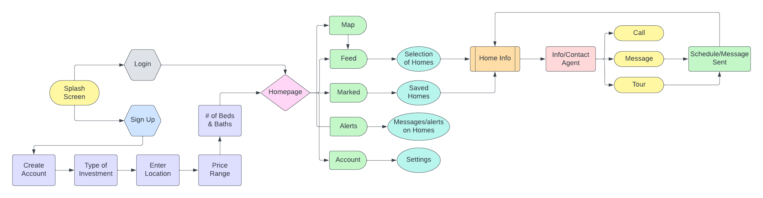
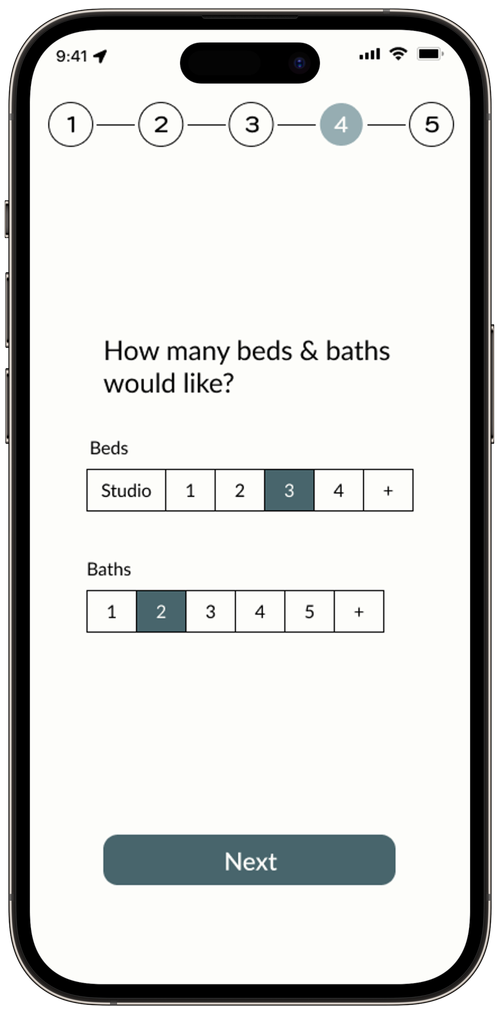
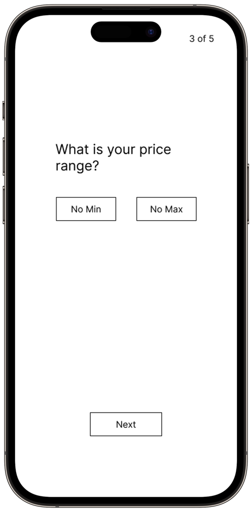
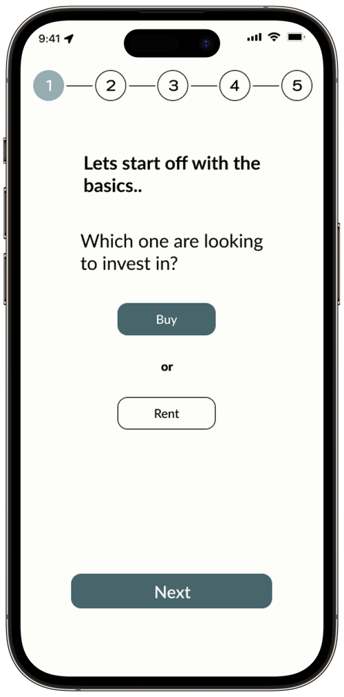
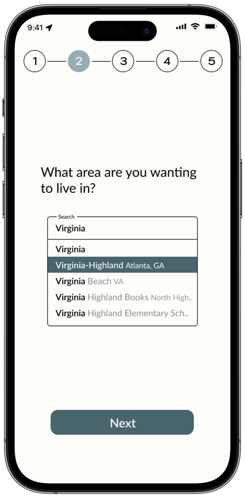
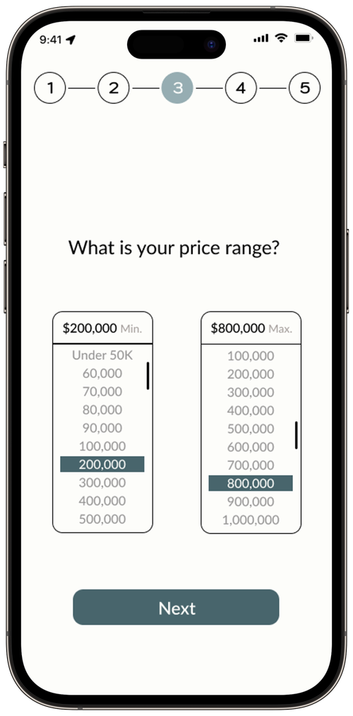
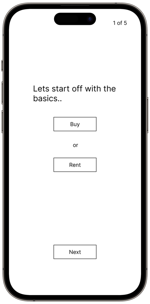
User Flow
Icons


"Make sure the property fits their needs and compare it to others, so they narrow down their given choices."
Mood Board
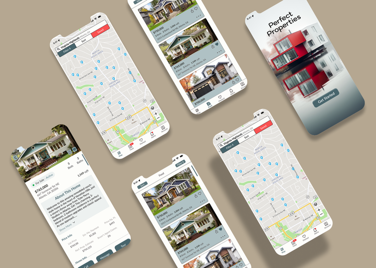
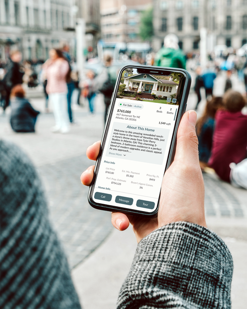
Final Prototype
Organization, refinement, and proper color choices are essential for app development today. Simplifying the app to attract more first-time buyers was key to the project's success. The main lesson learned was the importance of patience, as I had to repeatedly redesign some pages to make information more accessible for users.

Style Guide
Break Points


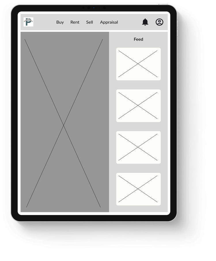
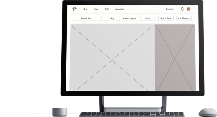
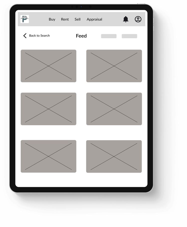
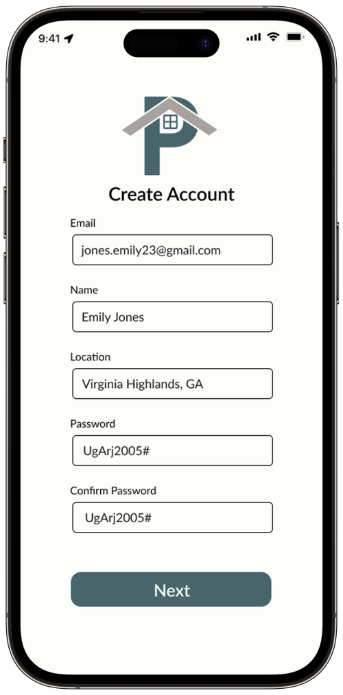
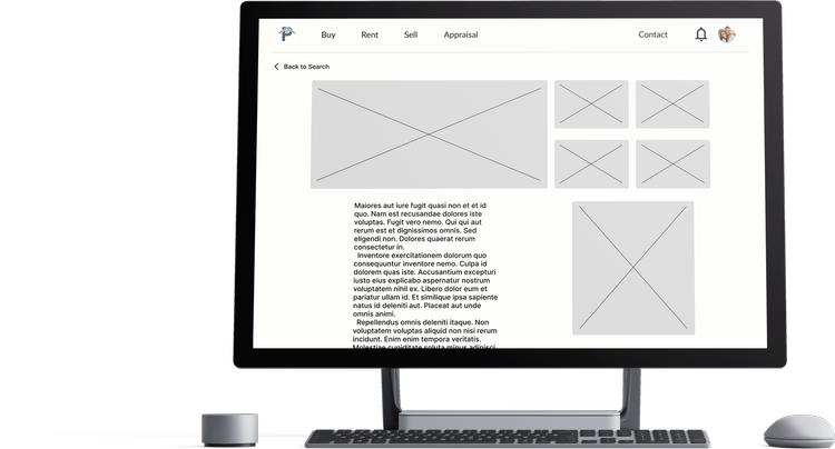
High Fidelity Wireframe
UI

Images


If you would like to view more, please click the link to the right.
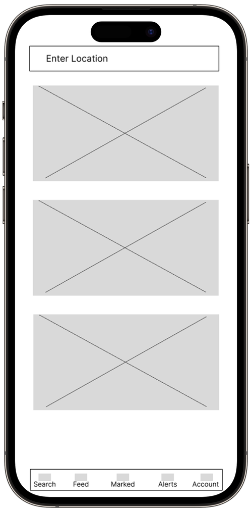
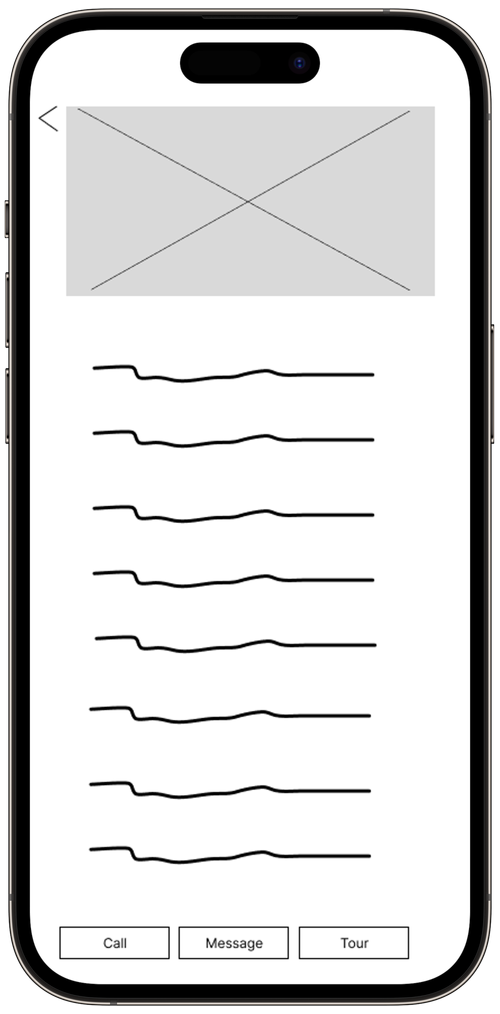
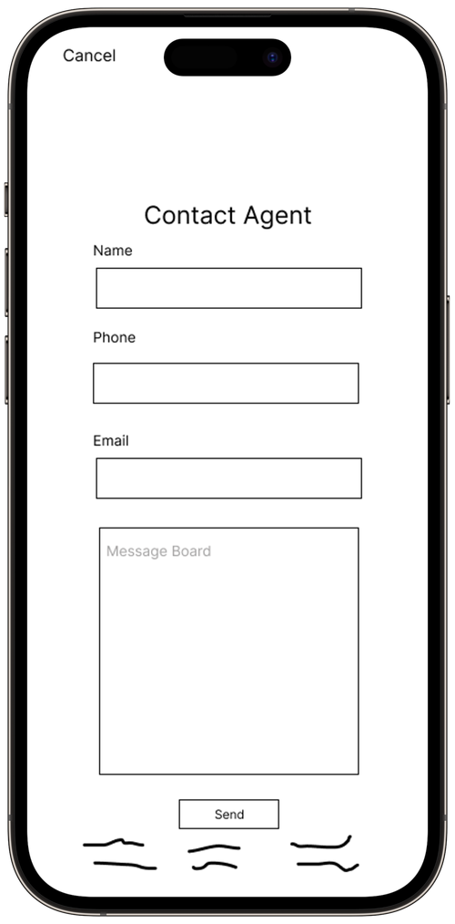
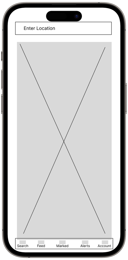
Low-Mid Fidelity Wireframe


Takeaways
What did you learn from a UI perspective?
What would you have added to your project?
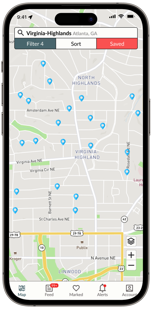
Add a feature for users to click on home markers to display a small image with the price. For the alert page, include location recommendations, offering alternatives in the same state that might have better pricing and schools while meeting user preferences. Lastly, refine the onboarding process for more tailored home options.